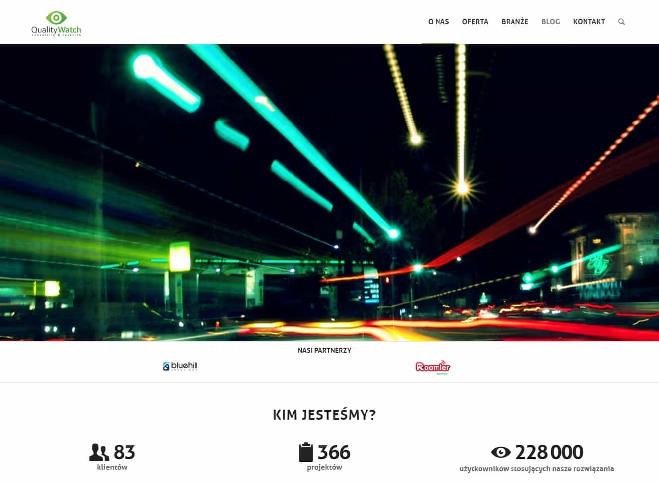
Quality Watch, a WordPress site for a mystery shopping agency
Quality Watch is a Warsaw research agency whose registered activity is market research and public opinion polling. The best known part of its offer is mystery shopping, alongside satisfaction studies and knowledge tests for sales and service staff. The site went live in 2017 after roughly six weeks of work, in the websites category, built on WordPress with a custom theme.
The brief was not “make it look modern”. It was closer to “make six overlapping service names legible to someone who has to justify the spend to a board”. That framing decided almost every technical choice that followed, so it makes sense to start there rather than with the stack.
How to present mystery shopper, caller and e-mail as one method
Put the service names next to each other and the difficulty becomes obvious. Mystery Shopping, Mystery Client, Mystery Caller and Mystery E-mail describe one research mechanism applied to four different contact channels. Customer journey mapping and service quality audits are a different kind of engagement entirely, sold to a different budget holder, on a different timescale. A page that drops all six into one bulleted list tells the reader that the company does many things and nothing in particular.
The reader is usually not the person who signs. In practice it is a quality manager or a retail network director assembling material to convince someone else. That changes the requirements more than any styling decision does. The text has to survive being lifted out of the browser and pasted into an internal deck: what the method is, how auditors are selected, what the report contains, what a visit scenario looks like.
Two consequences follow. First, every method needed its own durable URL, its own H1 and its own structured data, because the link is going to live in other people’s email for years. Sending someone a link and then explaining which tab to click is a failure of information architecture, not of the recipient. Second, the material had to be layered rather than shortened. Consulting content of this kind is long by nature, and the same page has to be skimmable in two minutes by someone who is only shortlisting vendors.
How to model overlapping research services by sector in WordPress
Layering reads as a design word and behaves as a data-modelling problem. The naive version, one long page with accordions, holds up until the agency starts selling the same method into several sectors. Then the retail description and the automotive description differ in three paragraphs out of twenty, and writing them separately creates three places where one correction has to be made three times.
So the model separates method from application. A method is one record describing the mechanism: who observes, in what role, what gets recorded, what comes back and in what form. An application is a separate record describing sector context. The template joins them at render time. The cost is real and worth stating: an editor has to understand the split before writing anything new, and an unusual one-off case is slower to publish than pasting a finished paragraph would be. The benefit arrives around the fifteenth variant, about a year in.
Case studies forced the most discussion, most of it outside the code. A research agency works with data it usually may not attribute. The record therefore treats the anonymous version as the default state rather than the exception: sector and network size are their own fields, brand name is optional. When the brand field is empty the template does not leave a gap where a logo should be, it lays the card out differently. That sounds like a detail until half the reference list has an empty field.
Why AJAX and REST endpoints on a brochure site
In 2017 this was not an obvious call for a marketing site, and it is not one I would make by default. Here it followed from the shape of the offer. Because the services overlap, nobody reads them in sequence. A visitor opens mystery shopping, goes back, checks mystery caller, compares report scope, goes back again. Under classic full page loads each of those moves costs a complete cycle: a fresh request, a full template render, the same assets fetched again.
Filtering the service list through REST endpoints means the browser fetches only what it does not already hold. The layout stays put. The cost comes in two parts and neither can be hidden. Every filter state needs its own address, otherwise a visitor cannot send a colleague what they are looking at and a crawler indexes nothing but the default view. And the data layer has to work without JavaScript, because consulting sites get opened inside corporate environments with restrictive browser policy. The base view is therefore rendered server side, and the asynchronous path only shortens the journey where it is available.
The endpoints earned their place in a second, less visible way. Client opinions and published findings change more often than the offer does and go through a different internal approval cycle. Moving them to their own resource meant an update no longer touches service page templates or invalidates their cache.
Why WordPress speed tests on an empty install mislead
The bottleneck on this project was behaviour under real traffic and cache invalidation, not the load time of the home page. The distinction matters. A clean WordPress install running the same theme answers quickly because there is nothing to compute: a small database, shallow relations, a service list that fits in one query. The same code against a copy of production, with the full catalogue of methods, applications, case studies and taxonomies, behaves differently, because assembling a filtered list touches several tables at once.
That is why the traffic paths were checked on a copy of production rather than on an empty instance. It is a rule that costs a few hours of setup and saves a week of surprise after launch. A copy of production surfaces things an empty install cannot: a query that is invisible at three records and is the most expensive operation on the page at two hundred, or a cache that technically works but is invalidated on every save of any content, so in practice does not exist.
The architectural tension sits exactly between caching and freshness. Service pages can be cached hard because they change rarely. The news and opinions block changes often and an editor expects to see their edit immediately. The resolution was to separate the two: the shell and the service pages cache long, while the volatile fragments load in their own request with a short lifetime and are invalidated per record on save rather than globally.
A quote form for mystery shopping that does not ask everything upfront
This site collects requests for quotes, not orders, and the difference shows up in code. A mystery shopping engagement cannot be priced from three fields, because the figure depends on the number of locations, visits per cycle, channels in scope and whether the client wants one aggregate report or a breakdown by site. A form that asks everything up front discourages people. A form that asks nothing produces enquiries that can only be answered with another question.
The compromise splits first contact from qualification. Required fields stay short, and the extensions appear only when the visitor indicates they already know what they need. Technically that means validation on the server rather than only in the browser, because client-side validation is a convenience and not a control. It also means anti-spam that does not rely on transcribing characters from an image, since on this particular site every extra step on the path costs an enquiry.
One more decision belongs here: the message field limit sits high enough not to truncate a real enquiry. It looks trivial and it is not. A short limit quietly clips a message mid-sentence and the sender never finds out, because all they see is the confirmation screen. That failure appears in no log and no test, only in a conversation that never happened.
Turning a client’s layout into responsive WordPress templates
Element placement and the visual layer were supplied by the client. Our part was turning that into templates, responsive behaviour and a content model that stays maintainable after launch. Aesthetics were not in dispute, the order of information was, and that is usually the only conversation worth having on a project like this.
The site is responsive for a concrete reason rather than a fashionable one: a large share of traffic here is someone who received the link by email and opens it on a phone between meetings. On a small screen the order of sections stops being a matter of taste, because the visitor sees two screens and either understands what the company does or returns to the inbox. HTML5, CSS3 with the SASS preprocessor and JavaScript give a clean layout and stable behaviour, but they do not decide for anyone what belongs above the fold.
Comparison tables needed separate attention. The side-by-side view of research methods is the main content of this site, and a table whose headers are not associated with its cells is, to a screen reader, a run of words without structure. That association is cheap to implement up front and expensive to retrofit, so it went in from the start.
What did not work first time: list filters and oversized photos
Work ran in the familiar order: scope analysis, then templates built on the client’s layout, then the content model and integrations, then testing of the key views, forms and user paths, then launch with basic monitoring and a short post-release review. The part worth recording is what did not work first time.
The first version of service list filtering remembered the selection in the URL but not the scroll position. A visitor who opened a method and pressed back landed at the top of the list and had to find their place again. On six items nobody notices. On a list that grew to several dozen once sector applications were added, that is the reason someone stops browsing.
The second fix concerned images. Reference photographs were uploaded at the resolution in which they arrived from the client, far larger than any view on the site. Size variants are generated automatically, but only for files uploaded after the relevant configuration is in place, so material migrated from the old site kept its originals. Finding it required looking at the transfer size of a specific subpage rather than at a measurement of the home page, which happened to be light.
The third item was not a defect but a trade-off, and it still looks like the right one. We dropped a plan to personalise content by visitor sector. It was technically feasible and sounded attractive, but it would have meant distinguishing visitors at a level where caching stops making sense, and the benefit would only show at an order of magnitude more traffic than this site actually sees. Sector is instead a choice the visitor makes deliberately, in one click, and that choice travels in a link.
Updating a custom WordPress theme with its own REST endpoints
Keeping the site at the level it launched at means regular core, theme and plugin updates, log monitoring, systematic backups and ongoing functional changes. Updates go to a staging environment first, because on a site with a custom theme and its own endpoints it is the theme and the endpoints, not the WordPress core, that tend to break on a version bump.
What carries forward from this project to the next one is the technical layer: JavaScript, HTML5, CSS3, SASS and AJAX look much the same every time. What does not carry forward is the content model or the integrations, because both were built for one client’s data and one brief. The next build starts with a scope analysis, and the quote follows it rather than preceding it.
Client: Quality Watch Scope: Web development, layout
More about the company: qualitywatch.pl
Frequently asked questions
Practical answers to apply the topic in real execution.
Popular questions
What scope did the QUALITY WATCH - Mystery Shopping & Customer Experience Solutions project cover?
#How did delivery run for QUALITY WATCH - Mystery Shopping & Customer Experience Solutions?
#What was the hardest technical part of QUALITY WATCH - Mystery Shopping & Customer Experience Solutions?
#What part of QUALITY WATCH could be reused on another build?
#Need an FAQ tailored to your industry and market? We can build one aligned with your business goals.
Let’s discuss